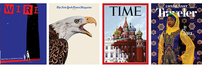
Print magazines are officially back from the dead. Look closely, and you’ll see how design is helping fuel their resurgence.
Just like their friends on the editorial side, designers know their audiences. The best have the confidence to speak directly to those readers — without using words.
Print genres are as varied as their readerships. But no matter the genre, certain trends bubble to the top. Below are three of my favorite recent magazine design trends, plus one I could definitely live without.
1. Covers go typeless

Indie mags have been ditching the abundant cover cuts for a while, and it’s finally becoming mainstream. Publishers use smart, attention-grabbing imagery to draw in readers. Covers are more focused and less fussy.
Consumer magazines have traditionally used heaps of cover lines simply because they’re essential to newsstand sales. However, reduced cover shows that a magazine’s creative team is secure with its readership and sure of its own vision.
These designers know core readers are committed, who don’t need to be lured in with a bevy of cover lines in different weights and sizes. Readers like to feel smart and be intrigued, and this treatment lets them do both at the same time. It won’t work for every publication, but when it does, the results are stunning.
2. From ultra minimalism to … minimalism

For a while there, it seemed like everyone was taking minimalism to the extreme. Now, the trend is retreating, with the bleeding-edge originators moving on from sterile sameness.
Minimalism isn’t exactly a new design trend, but it’s as popular as ever. Much of the ultraminimalism you see now comes from the legions of imitators trying to capture the sparkly magic of Kinfolk a decade ago. Always a step ahead, Kinfolk has moved on, injecting the pages with new warmth and energy while staying true to itself. The type treatments and layouts are more dynamic yet still elegant and timeless. The magazine’s willingness to evolve is refreshing — especially given its large and loyal following.
Negative space is intentional and helps designs “breathe.” But now, that negative space doesn’t always equal white space. Strong and beautiful color tones, when used correctly, add warmth to the sophistication of minimalism.
One great example of this trend is design darling The California Sunday Magazine. Its unique, minimalist vibe is infused with just enough personality and unexpected touches. The result? Meaningful design that impresses without overwhelming.
3. Photography meets hand-crafted elements

How do you create something outstanding with photography? Juxtaposition.
The combination of high-impact photography with freehand type and illustrations is everywhere, and for good reason. These handcrafted elements lend personality. The marriage of the two feels personal and genuine — even relatable. In a time when people crave authenticity more than ever, this analog trend fits right in. If it feels like the magazine’s design team cared enough to make a note or an illustration just for you, they’ve established a connection.
Backsliding trend:
Middle-aged white men are still dominating the covers of business magazines. THIS IS NOT OK. Do better.


